BTSE rebranding

team

1 Product Manager

3 Product Designers

1 Marketing Strategist

my Responsibility

Simplified existing style
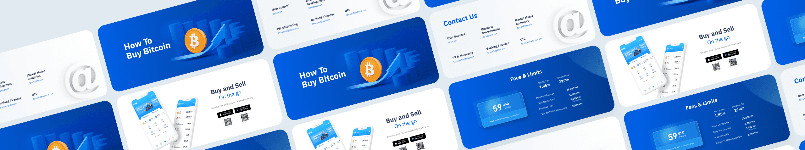
Visual exploration

Defined visual guideline

BTSE, a leading cryptocurrency exchange listed in the top hundred in the market. Established around 2019. Focus on crypto futures and spot trading.

BTSE, a leading cryptocurrency exchange listed in the top hundred in the market. Established around 2019. Focus on crypto futures and spot trading.

BTSE, a leading cryptocurrency exchange listed in the top hundred in the market. Established around 2019. Focus on crypto futures and spot trading.

Why

did

did

BTSE

need to

rebrand?

need to

rebrand?

1.

Target audience changed

Target audience changed

Target audience changed

Business services expanded from B2B to B2C. Target audience has grown from institutional traders to retail trading beginners.

2.

emphasized brand value

emphasized brand value

emphasized brand value

Be competitive. Built trending fintech visuals to align with the blockchain industry.

Limitations & Challenges

Limitation & Challenge

Design

Design

Design

No specific design principle to follow. Lots of design versions caused user and team mates confused.

Timeline

Timeline

Timeline

Building brand book guideline and enhancing platform features in the same time.

Unstable Human Resource

Unstable Human Resource

Unstable Human Resource

Unfixed project owner may caused project handover and integration difficulties.

Company Strategy

Company Strategy

Company Strategy

Unclear brand core and changes of target customers

to build a trustworthy impression

to build a trustworthy impression

our working plan

phase 1. explore and analyze
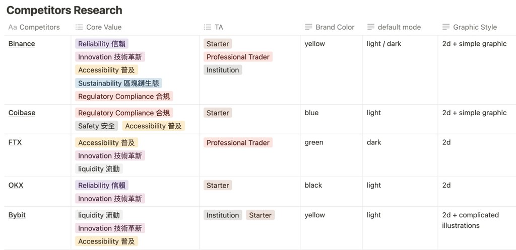
market research

competitors analysis

phase 2. brainstorm and define basic

design direction

brand color and font

graphic style definition

phase 3. design and define web

overview site map

homepage revision

web layout style definition

phase 4. develop and iterate

build UI library with RD

all pages style revamp

Research

identify their target audience through website marketing language and design.

Pro & Institutions

Tech innovation

Risk management

Competitive ecosystem

Beginners

Simple and secure

Friendly tutorials

Soft, welcoming web design

From Pro to Newbie
How We Transformed Our Platform Design

From Pro to Newbie
How We Transformed Our Platform Design

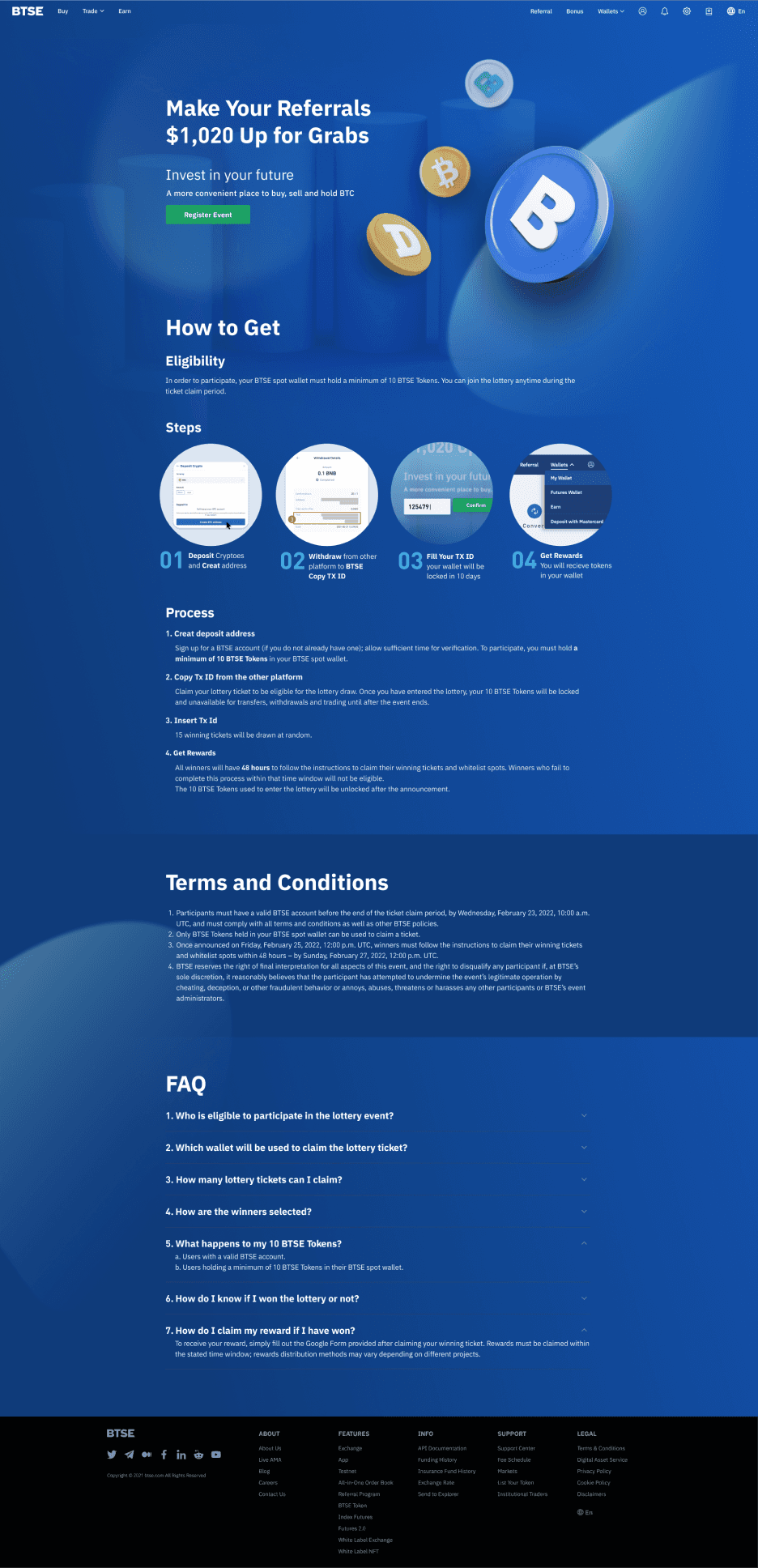
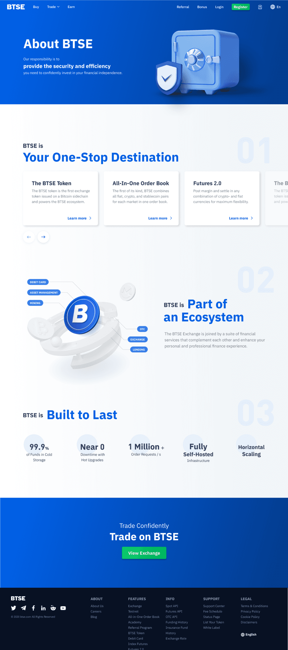
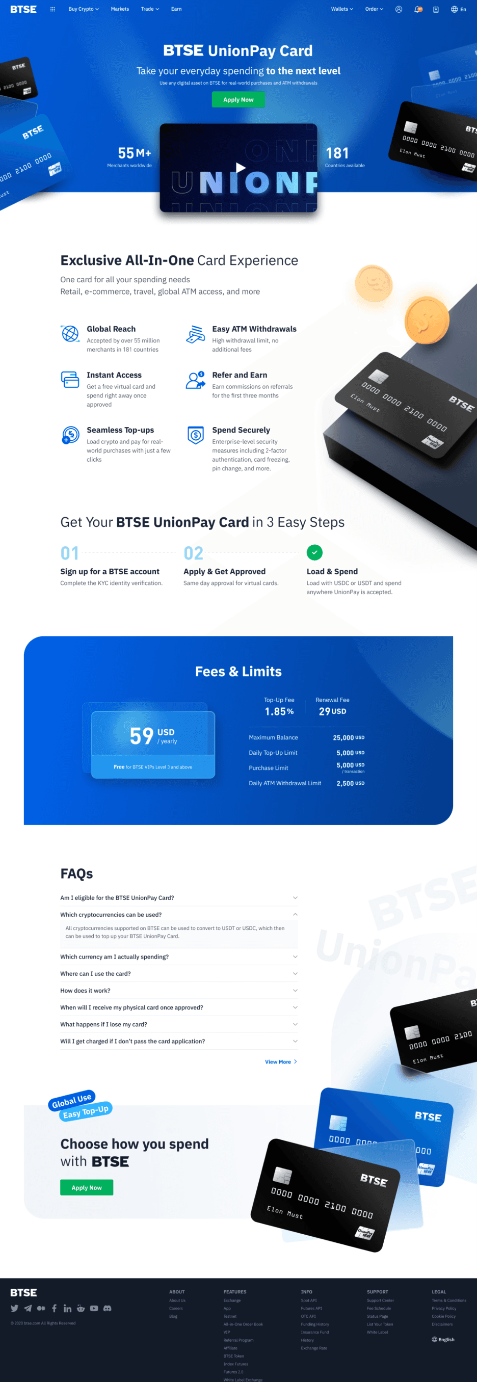
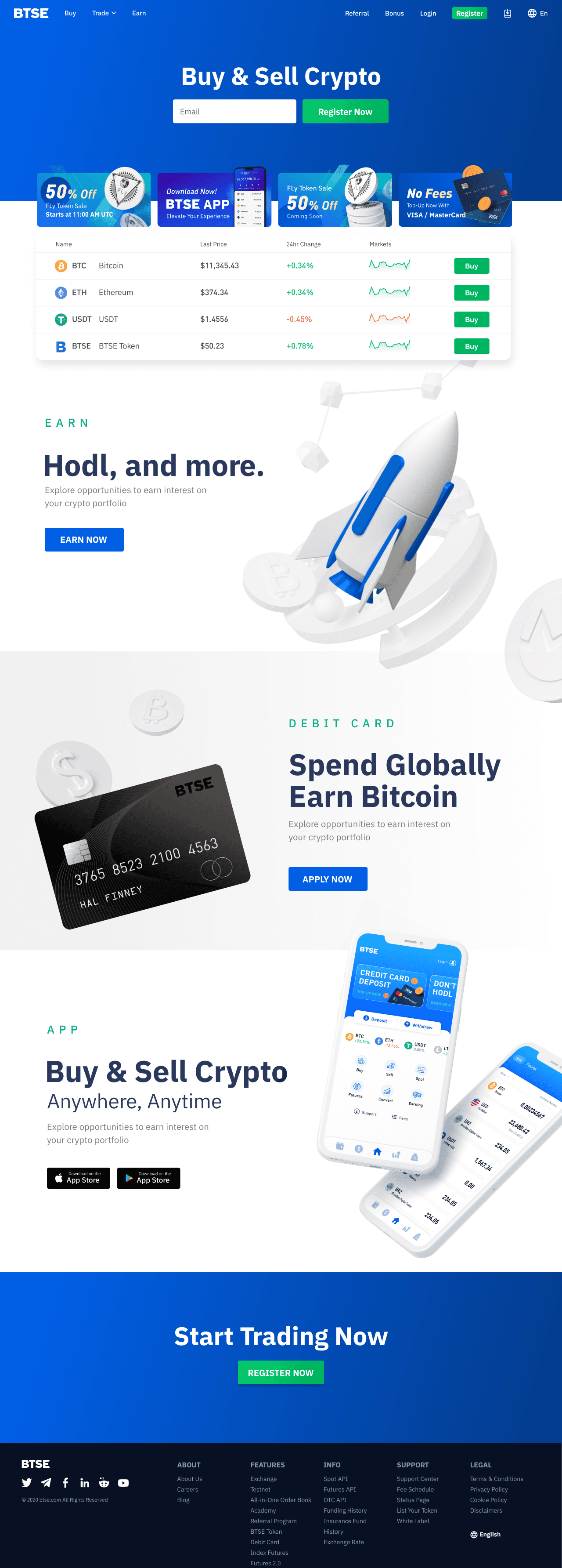
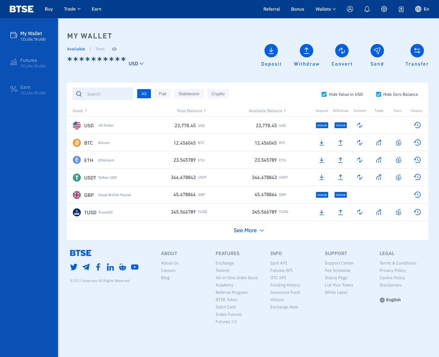
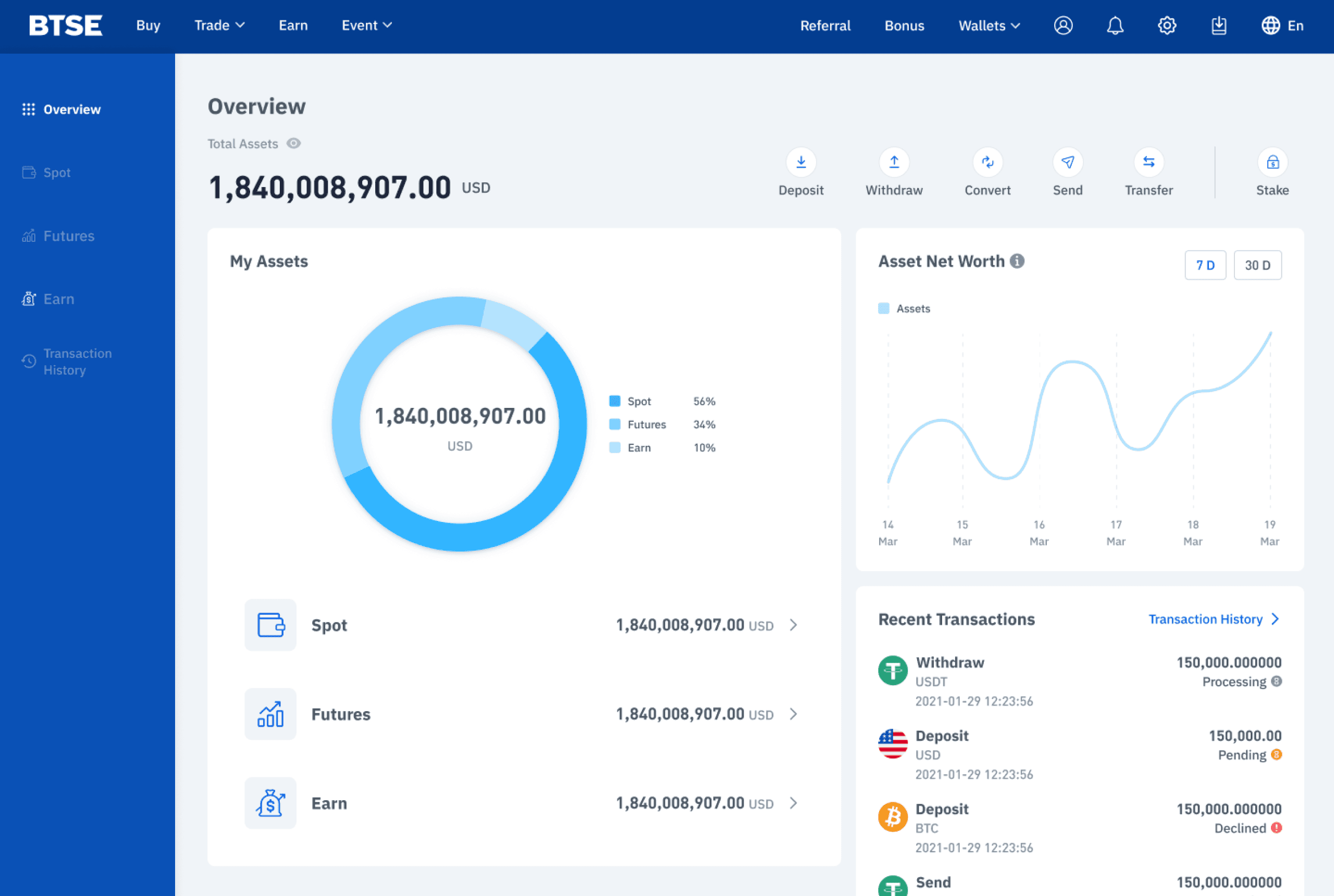
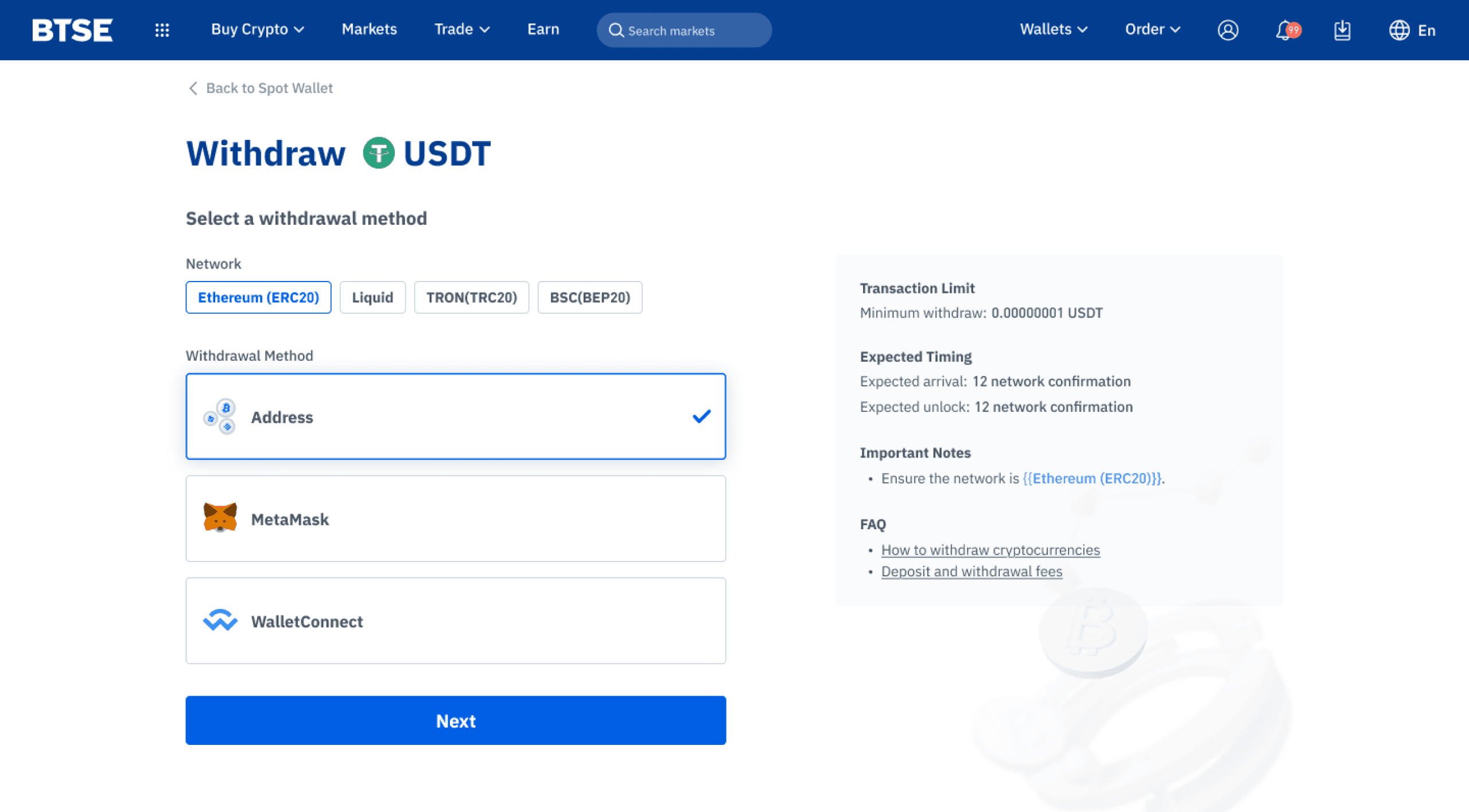
As the business expanded, our target audience evolved from primarily professional and institutional traders to include beginners. During this transitional phase, we shifted our visual identity to a lighter, more approachable design, making the platform more inviting for newcomers entering the crypto trading space.

build trust with blue

Maintained the original blue tone and utilized high saturation levels of blue as the BTSE brand color. Hope to convey a reliable brand image to customers, leading change and innovation in the blockchain industry.

primary

#015FE5

primary-darker

#015FE5

primary-light

#015FE5

accent
#015FE5

Title (Bold)

IBM plex sans 48px

IBM plex sans

IBM plex sans 36px

IBM plex sans

Sub Title (Medium)

IBM plex sans 24px

IBM plex sans 18px

Paragraph (Regular)

IBM plex sans 16px

IBM plex sans 14px

using 3D illustrations

and gradient color

to represent futuristic style

using 3D illustrations

and gradient color

to represent futuristic style

layout classifications were categorized

layout classifications were categorized

by content and functionality

by content and functionality

intro pages

pages such like general contents( ex: homepage, about page...) and promotional events

functional pages

pages such like dashboard and complex operated interfaces

before

after

after

before