Crypto history revamp

Project Type

ui / ux enhancement

web / app

team

1 product manager

1 app designer

2 web designers

Responsibility

competitors study

information architecture

detail page mockups

Problem

User Feedback

User Feedback

It's challenging to locate specific transaction records, such as those still pending water bill verification.

使用者回饋

使用者回饋

使用者回饋

很難找到特定的交易類型紀錄,例如:水單處理中的交易紀錄

很難找到特定的交易類型紀錄,例如:水單處理中的交易紀錄

Customer Service Feedback:

Customer Service Feedback:

During the deposit process, users frequently forget to upload their water bill. Customer service representatives often have to manually remind them.

客服人員回饋

客服人員回饋

客服人員回饋

入金流程中,用戶很常忘記要上傳水單,客服時常人工提醒用戶要記得上傳水單

入金流程中,用戶很常忘記要上傳水單,客服時常人工提醒用戶要記得上傳水單

goals

  1. Increase the completion rate of deposit orders.

  2. Reduce repetitive tasks for customer service.

  1. 增加入金訂單的完成率

  2. 降低客服重複性的勞動

Results

+14%

Deposit order completion rate

入金訂單完成率

-36%

Customer complaint rate

入金相關的客訴率

solutions

Optimized Entry Point

Optimized Entry Point

Streamlined access to the function.

優化入口點

優化入口點

優化入口點

縮短使用者尋覓功能的旅程

縮短使用者尋覓功能的旅程

Restructured information architecture

Restructured information architecture

Clearer transaction record categorization.

重整資訊架構

重整資訊架構

重整資訊架構

定義清楚且直觀的交易紀錄分類,讓用戶可輕鬆找到特定的交易紀錄

定義清楚且直觀的交易紀錄分類,讓用戶可輕鬆找到特定的交易紀錄

Streamlined Uploads

Streamlined Uploads

Prompts and shortcuts for pending orders.

簡化上傳水單的流程

簡化上傳水單的流程

簡化上傳水單的流程

針對用戶待處理訂單設立提示及捷徑,優化上傳水單的流程

針對用戶待處理訂單設立提示及捷徑,優化上傳水單的流程

process

Previous user journey
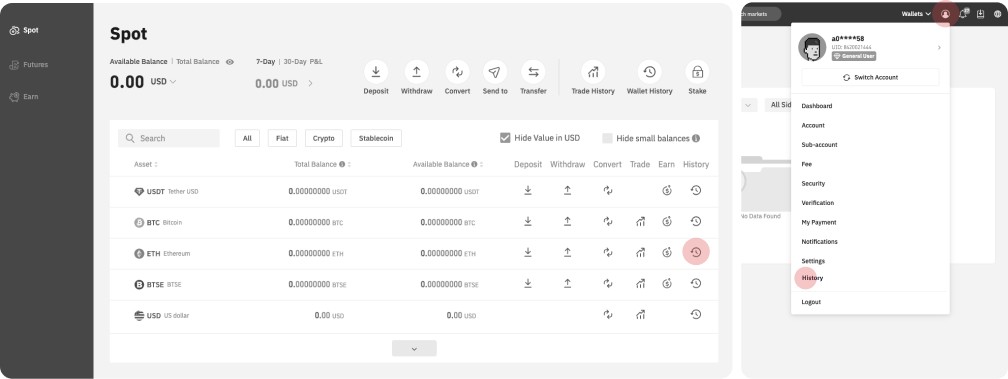
process

insights

Lack of notifications

Lack of notifications

Pending orders are not clearly displayed upon login, leading to users frequently forgetting to process them.

缺乏提醒

缺乏提醒

缺乏提醒

待辦訂單未於登入時清楚提示,導致用戶經常忘記處理

待辦訂單未於登入時清楚提示,導致用戶經常忘記處理

Confusing Entry Point

Confusing Entry Point

The main entry point's location is inconsistent with the information logic of surrounding functions.

入口混淆

入口混淆

入口混淆

主要入口位置與周邊功能資訊邏輯不一致

主要入口位置與周邊功能資訊邏輯不一致

Limited Entry Point

Limited Entry Point

While the secondary entry point is clearer, it only allows searching historical records by currency.

入口受限

入口受限

入口受限

次要入口雖較清晰,但僅能透過幣本位搜尋歷史紀錄

次要入口雖較清晰,但僅能透過幣本位搜尋歷史紀錄

Streamlined Uploads

Streamlined Uploads

Prompts and shortcuts for pending orders.

資訊散亂

資訊散亂

資訊散亂

交易紀錄分類不明確,使用者難以快速找到所需資訊

交易紀錄分類不明確,使用者難以快速找到所需資訊

process

new user journey

process

arranged a proper entry point
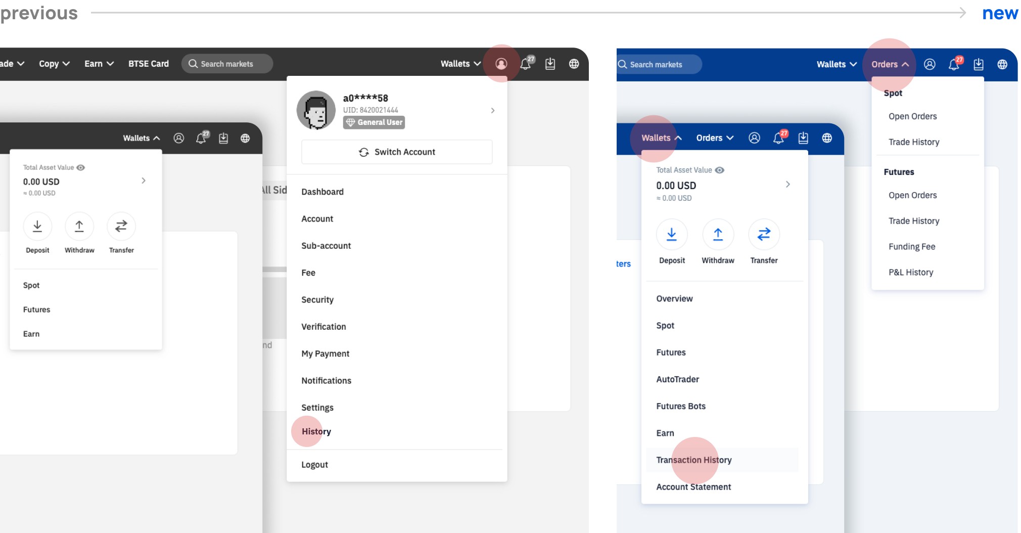
process

clearly defined transaction features

process

Using Colors to Distinguish Status

Due to coding restrictions in the backend development library, the 'processing' status needed to be handled differently. Therefore, I used colors to distinguish between different statuses.

由於後端開發函式庫的程式碼限制,「處理中」的狀態需要以不同的方式處理。因此使用顏色來區分不同的狀態

由於後端開發函式庫的程式碼限制,「處理中」的狀態需要以不同的方式處理。因此使用顏色來區分不同的狀態

What We Achieved


  • Improve user journey with clear entry points

  • Ensure consistent UX language and terminology

  • Implement logical and intuitive information architecture

  • Provide a unified user experience across web and app interfaces


  • Improve user journey with clear entry points

  • Ensure consistent UX language and terminology

  • Implement logical and intuitive information architecture

  • Provide a unified user experience across web and app interfaces

  • 透過清晰的入口點改善使用者旅程

  • 確保一致的 UX 語言和術語

  • 實施邏輯且直觀的資訊架構

  • 在 web 和 app 介面之間提供統一的使用者體驗