BTSE design system revamp

Project Type

design system

desktop / mobile

uiux

Team Members

eva hsieh
flora hua

anting yu

my role & Responsibility

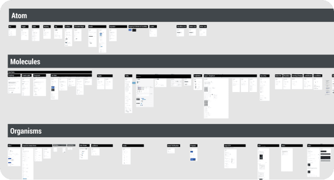
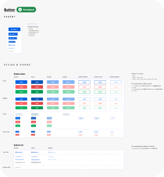
  1. design system Integration

  2. color palettes definition

  3. components creation & enhancement
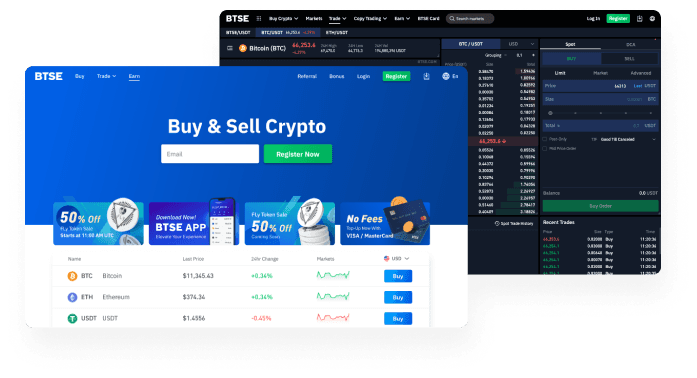
70+

components were maintained

30+

component creations

40+

components enhancement

about

BTSE, a leading cryptocurrency exchange listed in the top hundred in the market. Established around 2019. Its primary services focus on crypto futures and spot trading.

As business growth, there was a need to transition away from outdated styles and implement a system capable of handling complex products.

create better

design experience

to

and work more efficiently

our working plan

our working plan

step 1. find pain points

step 1. find pain points

step 1. find pain points

collected feedbacks

competitors analysis

other brand’s design system study

step 2. simplify

step 2. simplify

step 2. simplify

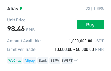
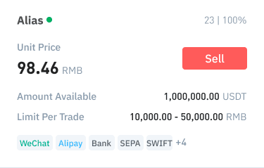
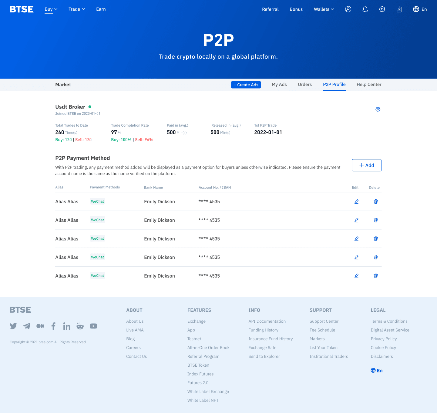
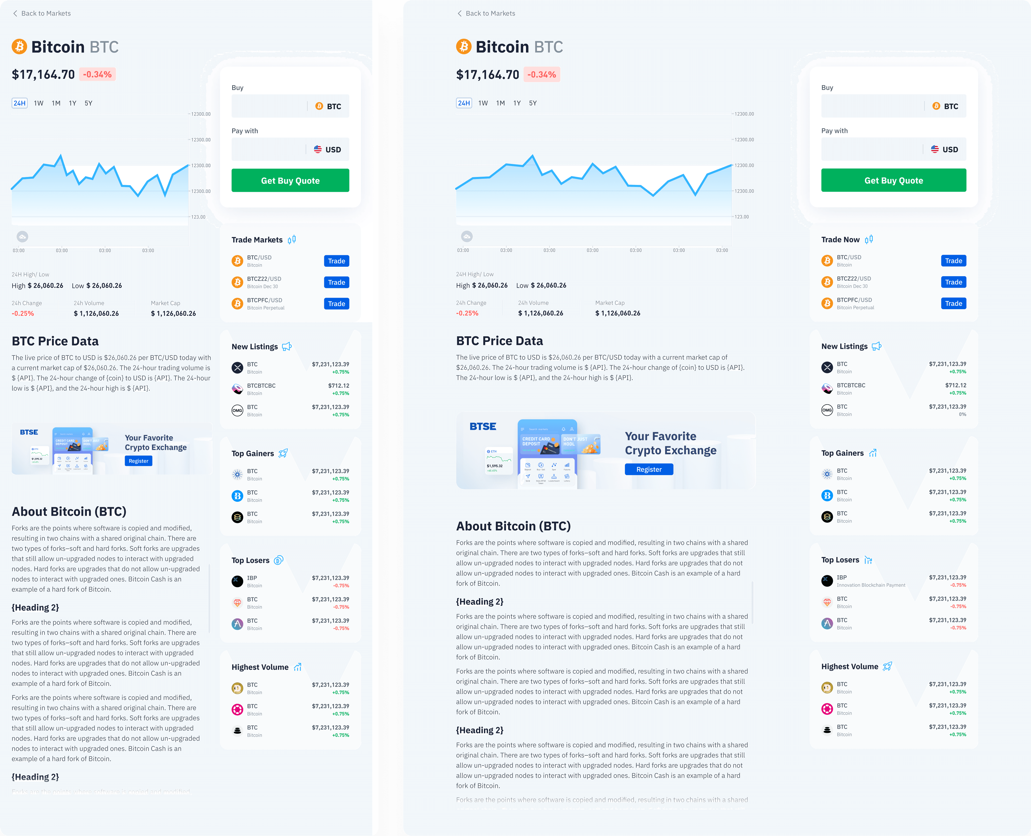
rearranged color palette

considered for white label user

removed useless font size
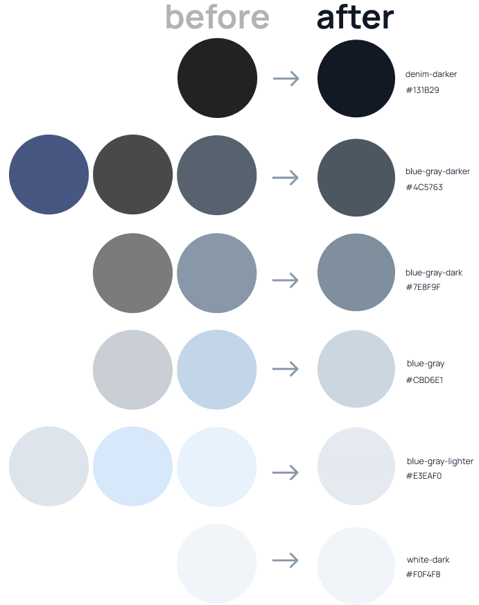
step 3. integrate & enhance

step 3. integrate & enhance

step 3. integrate & enhance

categorized and combined similar-looking UI components

provided clear definition of variant components

categorized and combined similar-looking UI components

we collected feedback from users and colleagues

Inconsistent design language…looks like a scam website

Inconsistent design language…looks like a scam website

Too much similar colors. Hard to recognize and maintain.

RD team

Confusing user experience

Outdated style… looks unprofessional

Unclear design style. Hard to follow.

design team

design team

simplified color

simplified color

  1. Removed confusing neutral colors

  2. Kept color at the same saturation level

  3. Defined a moderate color palette for different functional pages.

Removed confusing neutral colors and kept color at the same saturation level. Defined a moderate color palette for different functional pages.

made colors much easier to search and maintain

made colors much easier to search and maintain

primary-light

primary

primary-dark

primary-darker

blue-grey-lighter

blue-grey

blue-grey-dark

denim-light

denim

denim-dark

denim-darker

accent-green

accent-red

accent-yellow

Phase 2

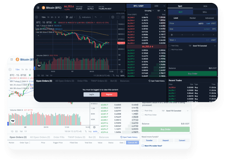
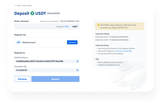
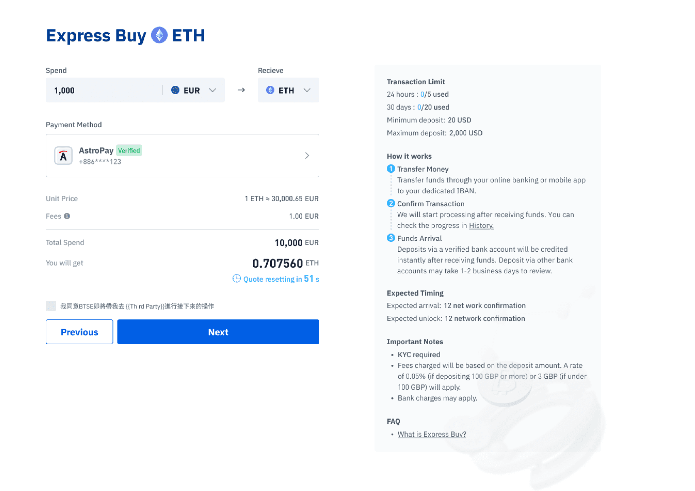
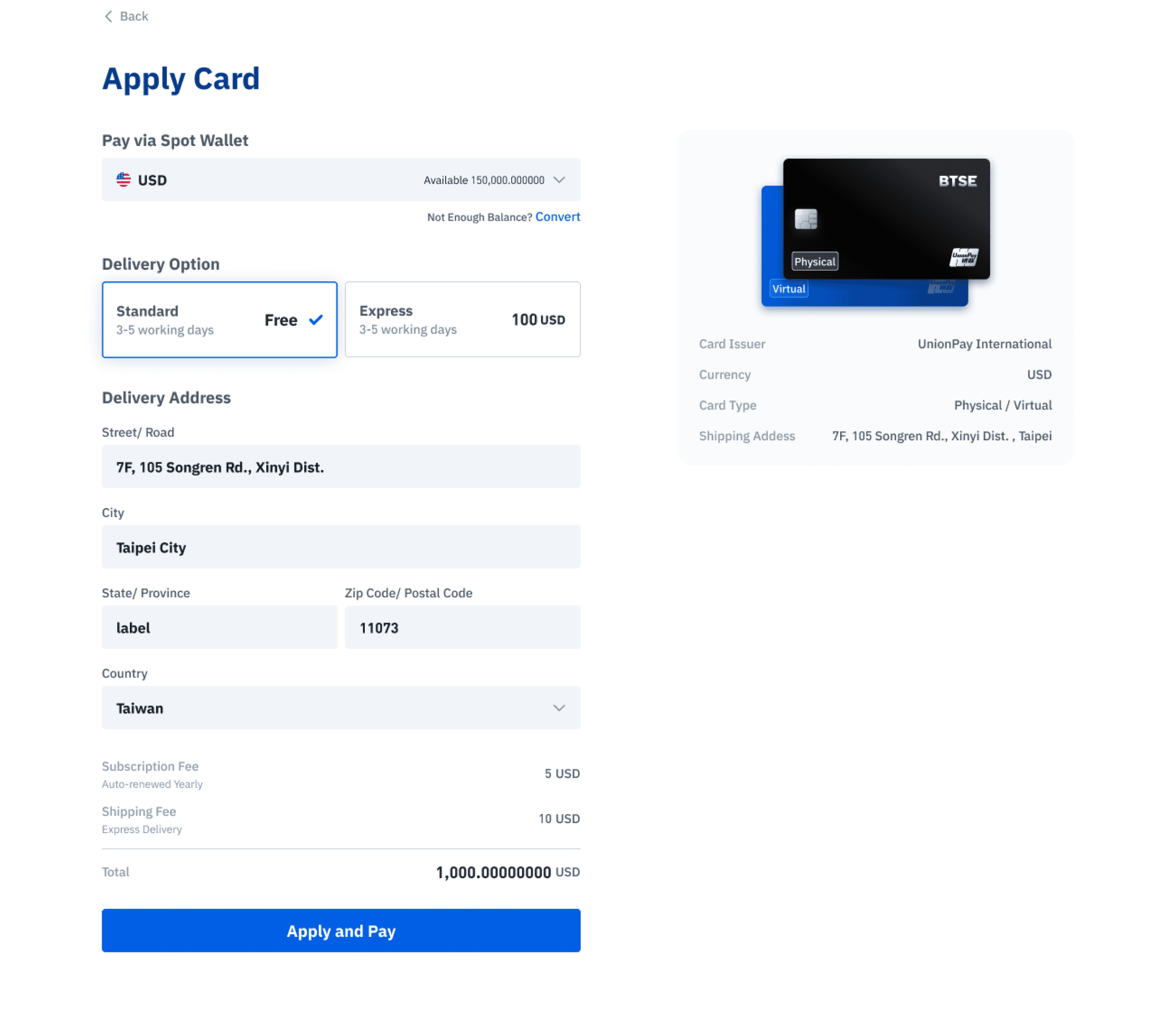
Integrated solutions

Used

atomic design rule

atomic design rule

atomic design rule

in order to create a systematic design guideline.

to create guideline.

Phase 2

high reusable & flexible ui

high reusable & flexible components

Phase 2

clear design definition

Phase 2

ensured design consistency

What We Achieved


  • Boosted design team productivity.

  • Improved cross-team collaboration and communication.

  • Made the product more user-friendly by ensuring component consistency